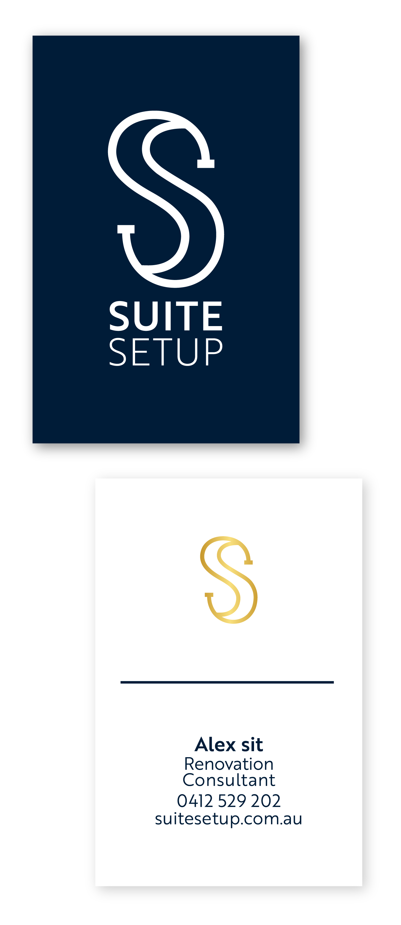
Renovation consultancy is an oversaturated and highly competitive field, which is why Suite Setup wanted a brand refresh to differentiate themselves from the herd whilst maintaining a classic and sophisticated look. This was achieved through light use of gold on the double S symbol and minimal aesthetics of both the logo and layout of the business card.
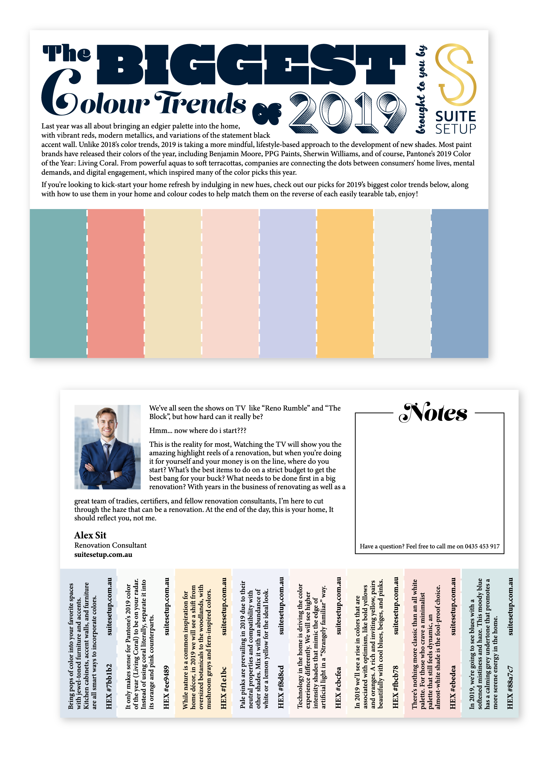
Keeping in theme, Suite Setup took the opportunity to show their revamped branding to current and potential clients with an A5 letterbox drop but in a way that gave more than the usual one dimensional cold call. What was actualised was a topical colour chart of 2019's biggest colour themes presented on a perforated A5, so the consumer could tear off what they liked and see what works for them, with pairing ideas to each theme along with contact info on the back of every swatch. This gave the consumer an initial taste plus ideas to talk about once they made contact.